


What Is a Heat Map? Types, Uses & Examples
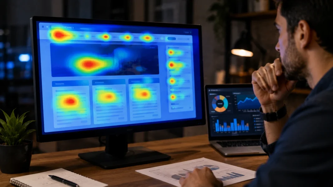
A heat map is a visual representation of data that uses colors to show differences in value, intensity, frequency, or activity across an area, grid, page, or dataset. Instead of asking users to study long tables of numbers, a heat map converts those numbers into patterns that can often be understood within seconds. Areas with greater activity may appear in stronger or warmer colors, while lower activity may appear in cooler or lighter shades, depending on the chosen color scale. Heat maps are widely used in website analytics, digital marketing, data science, finance, geography, healthcare, sports, business intelligence, and user experience research. Their strength is their ability to reveal patterns that ordinary numerical reports may hide. They help people quickly see where activity is concentrated and where gaps exist.
The meaning of a heat map changes slightly depending on the field in which it is used. A website heat map may show where visitors click, how far they scroll, or which page elements attract attention. A geographic heat map can display population density, crime concentration, sales activity, or weather patterns across locations. A matrix heat map may compare values across rows and columns, while an eye-tracking heat map can visualize where people look most frequently. Although the underlying datasets differ, the purpose remains similar: making patterns easier to recognize visually. This guide explains what a heat map is, how heat maps work, the main types, common uses, practical examples, advantages, limitations, and ways to interpret heat map data more accurately.
What Is a Heat Map?
A heat map is a data visualization in which colors represent differences in numerical values or activity levels. Instead of displaying every number separately, the visualization assigns colors to ranges of values so the viewer can identify high and low concentrations quickly. A darker or warmer color might represent more clicks, higher sales, greater density, or stronger correlation, while a lighter or cooler color represents lower values. The exact meaning depends on the legend attached to the visualization. Heat maps are particularly useful when a dataset contains many observations that would be difficult to understand through a spreadsheet alone. By turning numbers into visual patterns, they allow users to identify clusters, unusual areas, trends, and potential problems much faster.
The word “heat” does not mean that every heat map measures actual temperature. The term comes from the common practice of using warm colors such as red, orange, and yellow to represent areas of high intensity. Cooler colors such as blue or green may represent lower activity, although designers can use many other color scales. A website click map, for example, might color heavily clicked buttons bright red even though no physical heat exists. Likewise, a financial heat map might use green for positive stock performance and red for declines. The colors are symbolic rather than literal. Understanding the legend is therefore essential because the same color can represent completely different meanings in different heat map designs.
Heat maps can summarize very large amounts of information within a relatively small visual space. Imagine analyzing sales for hundreds of products across dozens of regions and several months. A conventional table might contain thousands of numbers, making it difficult to identify where unusually strong or weak performance occurs. A matrix heat map can color each cell according to sales volume, allowing high-performing combinations to stand out immediately. Decision-makers can then investigate the areas that deserve attention instead of reviewing every number individually. The underlying data still matters, but the visualization provides a faster route to useful questions. Heat maps therefore work especially well during exploratory analysis, when the goal is to discover patterns before performing deeper statistical investigation.
A heat map should not be confused with a chart that simply uses decorative colors. In a properly designed heat map, the color corresponds directly to a data value, category, or intensity level. The relationship between the data and color should be explained through a scale or legend so viewers can interpret it consistently. Poorly designed heat maps may exaggerate tiny differences or make meaningful differences difficult to see. Color choice can also create accessibility problems for people with color vision deficiencies. Effective heat map design therefore requires both accurate data and thoughtful visualization. The goal is to reveal the structure of the information rather than creating a visually impressive graphic that leads users toward incorrect conclusions.
The popularity of heat maps comes largely from their ability to combine speed and detail. Executives can use them to identify business patterns, marketers can see which parts of a landing page receive engagement, and analysts can compare relationships across large datasets. Researchers may use heat maps to display gene expression, while sports analysts can show where athletes spend the most time on a field. Designers can study where users click or scroll on a website, and geographic analysts can map concentrations across cities or countries. Few other visualization formats work across such different situations. The fundamental principle remains the same in every case: translate data intensity into a color pattern that makes important differences easier to recognize.
How Does a Heat Map Work?
A heat map begins with a dataset containing values that can be associated with specific positions, categories, cells, or areas. In a website heat map, the position may be an exact point on a web page where a visitor clicked. In a matrix heat map, it may be the intersection between a row and column. In geographic analysis, the position could represent coordinates, neighborhoods, postal codes, or regions. Software collects or imports the relevant values and organizes them according to the structure of the visualization. Each location then receives a numerical value or calculated intensity. The visualization engine converts those numbers into colors based on a predefined color scale, producing the pattern users see on the screen.
Color mapping is the step that turns raw numerical information into a visual heat map. Suppose a dataset contains values ranging from zero to one hundred. The designer may choose pale yellow for values near zero and dark red for values approaching one hundred. Intermediate values receive colors between those extremes. Another visualization might use blue for negative values, white for values near zero, and red for positive values. The scale should fit the meaning of the data rather than follow a universal rule. Sequential color scales work well for values increasing from low to high, while diverging scales are useful when data moves in two directions around an important midpoint.
Website heat maps typically require behavioral tracking before the visualization can be created. A tracking script records user interactions such as clicks, taps, mouse movement, or scrolling, depending on the heat map type. The analytics platform combines data from many sessions to identify areas receiving the most activity. Individual interactions may be represented as points, but the finished map usually displays broader zones so patterns are easier to interpret. If hundreds of visitors click the same call-to-action button, that region appears more intense than an area receiving only a few interactions. The map is therefore an aggregation rather than a video of one person’s behavior. Session recordings may complement heat maps when analysts need to examine individual journeys in greater detail.
Geographic heat maps often work by aggregating values within geographic areas or calculating density around points. A retailer might plot store purchases according to customer location and use intensity to identify areas with higher concentrations of sales. Public agencies can visualize accident reports, population density, traffic incidents, or disease cases in similar ways. The visualization may use boundaries such as counties or districts, or it may create smooth density surfaces that spread around individual coordinates. These techniques communicate slightly different information, so analysts should choose the appropriate method. A high-density region does not automatically explain why activity is concentrated there. The map identifies where the pattern exists, while additional analysis determines the underlying reasons.
Heat maps can also be generated from calculated relationships rather than directly observed events. A correlation heat map, for example, compares several variables and uses color to show the strength and direction of their relationships. Each cell represents the correlation between two variables, allowing analysts to identify patterns across an entire dataset quickly. Machine-learning workflows may use similar matrix heat maps to display confusion matrices, feature relationships, or model performance. The visualization becomes a compact summary of many mathematical calculations. This demonstrates why heat maps are not limited to location or user behavior. Any structured dataset that can meaningfully associate values with positions in a visual grid can potentially be represented through heat mapping.
Main Types of Heat Maps
Click heat maps are among the most common types used in website optimization. They show where visitors click or tap on a page, allowing marketers and UX teams to see which buttons, links, images, menu items, and other elements attract interaction. Frequently clicked areas appear with greater visual intensity than areas receiving little or no engagement. Click maps can reveal whether visitors notice the primary call to action or become distracted by less important elements. They may also identify non-clickable images or text that users mistakenly expect to be interactive. This information can guide layout changes, button placement, navigation design, and conversion optimization. Click heat maps are particularly useful when behavioral patterns differ from what the page designer originally expected.
Scroll heat maps show how far users travel down a web page before leaving or navigating elsewhere. The upper section of most pages receives exposure from nearly every visitor, while fewer people typically reach content located far below the initial viewport. A scroll map assigns colors to different page depths based on the percentage of visitors who reach them. This can help marketers determine whether important information or conversion elements appear too low on the page. If only twenty percent of visitors reach a major offer, moving it upward may improve visibility. However, declining attention as a page becomes longer is not automatically a design failure. The important question is whether the right users reach the content required to complete their journey.
Move heat maps, sometimes called hover or mouse-tracking heat maps, visualize where desktop users move or pause their cursors. Analysts sometimes use these patterns as an approximation of visual attention, although mouse position is not the same as actual eye movement. A visitor can look at one area while keeping the cursor somewhere completely different. Despite this limitation, move maps can still reveal how people explore menus, illustrations, pricing tables, forms, and other interactive regions. They may also highlight hesitation around complicated page elements. Because mobile users interact through touch rather than a continuous pointer, move maps are primarily useful for desktop behavior. They should be interpreted alongside click, scroll, and other behavioral data rather than treated as definitive evidence of where users looked.
Eye-tracking heat maps are produced from specialized technology that measures where participants actually direct their gaze. Researchers may use cameras or sensors to record fixation points and eye movements as participants view a website, advertisement, package, product, interface, or physical environment. Areas receiving longer or more frequent visual attention appear more intense on the finished map. Eye tracking can provide deeper information than cursor tracking because it measures visual behavior directly, but it is also more expensive and generally involves smaller controlled studies. Researchers may use it to examine whether people notice a brand logo, warning message, product image, or navigation element. Eye-tracking heat maps are common in UX research, advertising studies, psychology, retail testing, and human-computer interaction.
Matrix and geographic heat maps make up another major group. A matrix heat map organizes values within rows and columns, making it valuable for correlation analysis, financial performance, survey data, scientific research, and operational dashboards. Geographic heat maps attach values to physical locations and are useful for population analysis, sales territories, crime statistics, transportation, logistics, and public health. Calendar heat maps are another variation that use days, weeks, or months as the grid structure, making patterns in activity over time easy to see. GitHub-style contribution charts are a familiar example. These different formats demonstrate how flexible the heat map concept is. The visualization structure changes, but color always helps communicate differences in data intensity.
Website Heat Maps and UX Analysis
Website heat maps help teams understand what visitors actually do after landing on a page. Traditional web analytics can report page views, conversion rates, bounce behavior, traffic sources, and other quantitative metrics, but those numbers do not always explain how users interact with individual page elements. A heat map adds a visual behavioral layer by showing where interaction concentrates. Marketers can see whether visitors click the intended call-to-action button, whether navigation links attract attention, and whether important content is reached through scrolling. This information can reveal differences between the page’s intended design and actual user behavior. Instead of changing layouts based entirely on opinion, teams can use behavioral evidence to decide which areas deserve further testing.
Landing pages are particularly suitable for heat map analysis because they usually have a clear conversion objective. A page may want visitors to purchase a product, request a demo, download a resource, submit a form, or sign up for a service. A click heat map can show whether interaction is concentrated around that main action or dispersed across secondary links. Scroll maps can identify whether critical proof, pricing, or offer details appear beyond the point where many visitors stop reading. If users repeatedly click images that are not interactive, designers may decide to make those images clickable or change their presentation. These patterns can generate valuable optimization hypotheses. Heat maps do not automatically tell teams which design change will succeed, but they help identify what should be tested.
Ecommerce websites can use heat maps to evaluate category pages, product pages, shopping carts, and navigation. A retailer may discover that shoppers repeatedly click product photographs expecting zoom functionality, or that a size guide receives little attention because it is difficult to notice. Scroll data might reveal that product reviews are placed below the point where most users stop exploring. On category pages, click concentration can show which filters, products, and sorting options receive the most engagement. Mobile and desktop behavior should usually be analyzed separately because screen size changes layout and interaction patterns substantially. A design that works well with a desktop mouse may be difficult to use with a thumb on a smartphone. Device-specific heat maps can expose these differences clearly.
Heat maps can also help evaluate forms. If users repeatedly click a particular field, pause around one section, or abandon before reaching the submit button, the form may contain unnecessary friction. Heat map information becomes more useful when paired with form analytics that show field completion, errors, and drop-off. A complicated form may require fewer fields, clearer instructions, better error messages, or a different sequence. However, teams should avoid assuming that every low-interaction field is unnecessary. Some fields are required for legal, operational, or qualification reasons even if users do not enjoy completing them. Optimization should balance conversion goals with the real information the business needs. Heat maps provide evidence about behavior, while product and business context determine the appropriate response.
Privacy should remain part of website heat map implementation. Behavioral analytics tools can collect significant interaction data, and organizations should configure them according to applicable privacy laws, consent requirements, and internal policies. Sensitive form fields should be masked or excluded from recording where necessary. Financial, health, authentication, and personally identifiable information deserve particular protection. Companies should also review vendor data-processing practices rather than installing tracking scripts without understanding what information leaves the website. Good user research does not require collecting everything technically possible. The strongest analytics programs collect the minimum data needed to answer meaningful questions while respecting user privacy and security throughout the process.
Business, Marketing, and Data Analytics Uses of Heat Maps
Sales teams can use geographic heat maps to identify where customers, prospects, or revenue are concentrated. A national company might map purchases by city or postal code and quickly identify regions performing above or below expectations. This can guide sales territory design, advertising budgets, store expansion, or staffing decisions. A high-revenue area could justify additional account coverage, while a region with strong population potential but weak sales may deserve investigation. The heat map provides visual context that a simple ranking of regions cannot. However, concentration should be adjusted for relevant factors such as population or market size before conclusions are drawn. High sales in a large city may be less impressive when measured per customer than moderate sales in a smaller market.
Marketing teams use heat maps both on websites and across campaign-performance dashboards. An email campaign heat map may show which links attract the greatest engagement, while a campaign matrix can compare conversion rates across audiences and channels. SEO professionals can create heat-style visualizations of keyword rankings across geographic locations or groups of landing pages. Paid advertising teams may visualize performance according to hour, day, campaign, audience, or device. These views make underperforming segments easier to notice than rows of identical-looking metrics. Heat maps are especially helpful during monitoring because unusual changes appear visually. Once an issue is identified, marketers can move into detailed reports to determine whether creative, targeting, bidding, landing pages, or another factor explains the performance difference.
Financial analysts can use heat maps to monitor markets, portfolios, budgets, or company performance. Stock market heat maps commonly display companies as colored blocks, with color representing price movement and block size sometimes representing market capitalization. A viewer can immediately see whether gains or losses are concentrated in technology, finance, energy, or another sector. Internal business dashboards can use similar techniques for revenue growth, profit margins, expenses, or forecast variance. Finance teams may also use matrix heat maps to compare business units against multiple performance measures. The format is powerful because executives can recognize broad patterns before examining individual accounts. Color should nevertheless complement numerical data rather than replace it when precise values are needed for financial decisions.
Operations and logistics teams can visualize delivery demand, warehouse activity, customer service volumes, or equipment utilization through heat maps. A logistics company might identify neighborhoods receiving the highest delivery density and redesign routes accordingly. A warehouse could visualize picking frequency to determine whether commonly requested products should be stored closer to packing stations. Customer support managers can create time-based heat maps showing which hours and days receive the most requests, improving staffing decisions. Manufacturing teams may visualize defect patterns across machines, production lines, or shifts. Each example uses the same principle of concentrating attention where activity is strongest. Once those patterns become visible, teams can redesign processes, allocate resources, or investigate anomalies more efficiently.
Scientific and healthcare applications demonstrate that heat maps extend far beyond commercial analytics. Researchers use gene-expression heat maps to compare biological activity across samples and experimental conditions. Medical imaging researchers may visualize concentrations or model attention across scans, while epidemiologists can map case density across geographic areas. Hospitals can use operational heat maps to study patient flow, appointment demand, or resource utilization. Sports analysts may plot player movement, shot locations, or defensive activity across a field or court. These examples involve very different datasets, yet color makes dense information easier to interpret. Heat maps are therefore valuable wherever analysts need to compare many values simultaneously and identify where meaningful concentration or contrast occurs.
How to Read and Interpret a Heat Map
Begin by reading the legend before drawing conclusions from any heat map. Colors do not have universal numerical meanings, so a dark red area might represent one hundred clicks in one visualization and negative financial performance in another. The legend explains which values correspond to each color and whether the scale is continuous or divided into categories. Also check whether the scale is linear, logarithmic, percentile-based, or normalized because these choices influence how dramatic differences appear. A map can make moderate variation look extreme if the color range is narrow. Conversely, a very broad scale can hide important differences. Understanding the transformation between numerical values and visual colors is therefore the foundation of accurate interpretation.
Next, look for clusters rather than focusing only on one intense cell or region. A single unusually colored area can result from noise, a data error, or a small sample, while a broader pattern is more likely to deserve investigation. Website teams might observe several nearby elements receiving unexpected clicks rather than concentrating on one isolated point. A geographic analyst may identify a continuous corridor of high activity rather than one city. Matrix heat maps can reveal blocks of variables behaving similarly. Patterns become even more meaningful when they repeat across different time periods or user segments. Comparing several related heat maps often provides stronger evidence than relying on one snapshot that may reflect temporary circumstances.
Sample size should always be considered. A landing-page heat map generated from twenty visitors can look visually persuasive even though those interactions may not represent typical behavior. Similarly, a regional sales heat map based on very few transactions can create apparent hotspots that disappear once more data is collected. Larger samples generally provide more stable patterns, although the necessary amount depends on the use case and variability of behavior. Analysts should check the underlying counts before acting on visual intensity. Heat maps are especially vulnerable to false confidence because colors feel intuitive and definitive. A visually strong hotspot should still be supported by enough observations to justify a business or design decision.
Segmentation can reveal patterns hidden in an overall heat map. Desktop visitors may click completely different elements from mobile visitors because layouts change between devices. New customers may behave differently from returning customers, while paid advertising traffic may engage differently from organic search visitors. Geographic sales patterns can vary by product category, customer age, or season. Combining all users into one visualization may produce an average that accurately describes no important segment. Good analysts therefore create separate heat maps when a meaningful behavioral difference is likely. Segmentation should remain purposeful rather than producing dozens of maps without clear questions. The objective is to understand why patterns differ, not merely to generate more colorful reports.
Finally, treat a heat map as a source of questions rather than automatic answers. If visitors ignore an important call-to-action button, the visualization proves that interaction is low but does not explain the reason. The button may have weak copy, poor contrast, low relevance, confusing placement, or an offer users simply do not want. Additional evidence from analytics, surveys, user interviews, session recordings, and A/B testing can clarify the cause. The same principle applies to geographic or business heat maps. A low-performing region might suffer from weak distribution rather than low demand. Heat maps excel at revealing where something unusual happens. Deeper research is usually required to explain why it happens and what should be changed.
Practical Heat Map Examples
Imagine an ecommerce product page where the primary “Add to Cart” button receives fewer clicks than expected. A heat map shows that visitors click repeatedly on product photographs and color swatches but rarely interact with the purchase button. A scroll map also reveals that many users never reach detailed sizing information located farther down the page. The retailer could hypothesize that customers need more product confidence before buying and test improved image zoom, clearer variant selection, and more visible sizing guidance. Importantly, the team should not redesign the entire page immediately based only on the heat map. The visualization identifies friction points, while controlled testing determines whether the proposed changes actually improve conversion.
A B2B software company might use a scroll heat map on a landing page promoting a free product demo. The map shows that nearly all visitors see the headline and introductory section, but only forty percent reach customer testimonials and twenty percent reach the demo form at the bottom. This does not necessarily prove that the page is too long, because interested users may still convert successfully. However, the company could test moving a secondary demo button higher on the page while keeping supporting information below. If conversions improve, the heat map helped identify an opportunity. If they do not, the real problem may involve the offer, audience, or messaging. The visualization should guide experimentation rather than dictate design decisions.
A restaurant chain might create a geographic heat map using delivery orders across a large city. Several neighborhoods show strong order density even though the nearest restaurant locations are relatively far away. This pattern may indicate an opportunity for a new branch, ghost kitchen, or targeted delivery operation. Another neighborhood may have large population numbers but little demand, prompting research into competition, brand awareness, pricing, or demographic fit. Decision-makers could combine the heat map with delivery times, average order values, rent costs, and customer acquisition data before choosing a location. Geographic intensity provides an excellent visual starting point, but location strategy still requires financial and operational analysis beyond the map itself.
A customer support team could create a calendar heat map showing ticket volumes by hour and day of the week. Darker cells might reveal that Monday mornings and weekday afternoons consistently generate the greatest support demand. Managers could adjust staffing schedules so more agents are available during those periods instead of distributing employees evenly throughout the week. Another heat map might separate billing, technical, and account questions to reveal that each category peaks at a different time. These patterns could improve both staffing efficiency and customer wait times. The example demonstrates that heat maps are not only useful for websites or physical locations. Any repeated process involving time and volume can often be represented effectively through a grid.
A data scientist might use a correlation heat map before building a predictive model. Rows and columns represent variables such as customer age, income, purchase frequency, average order value, churn, and support interactions. Each cell displays the correlation between two variables, with colors indicating relationship strength and direction. Strongly related variables stand out visually, allowing the analyst to investigate redundancy or potentially useful predictors. However, correlation does not prove causation, and relationships can be influenced by other variables or nonlinear patterns. The heat map therefore simplifies exploratory analysis rather than replacing statistical reasoning. Its value comes from helping the analyst decide where deeper investigation should begin across a dataset containing many possible relationships.
Benefits and Limitations of Heat Maps
The biggest advantage of heat maps is speed. People can often recognize high and low areas faster through color than by comparing dozens or hundreds of individual numbers. This makes heat maps useful for dashboards, presentations, exploratory analysis, and monitoring environments where decision-makers need to notice patterns quickly. They also reduce visual clutter when displaying large matrices that would otherwise require lengthy tables. A good heat map directs attention toward unusual values without requiring viewers to memorize every metric. This can improve communication between analysts and nontechnical stakeholders. However, speed should not come at the expense of accuracy, so precise values should remain accessible when decisions depend on small numerical differences.
Heat maps are also useful for discovering patterns that analysts did not know to look for beforehand. A website team may expect users to click one button but discover an entirely different hotspot. A retailer might uncover an unexpected geographic cluster of customers, while a researcher may notice relationships between variables that were not part of the original hypothesis. This exploratory strength makes heat maps excellent diagnostic tools. They allow viewers to move from “What is happening?” to more specific questions about causes. Visual discovery can be especially valuable when datasets contain hundreds of categories or observations. Rather than testing every possible relationship individually, analysts can use the heat map to identify the most promising areas for deeper investigation.
A limitation is that color can oversimplify complex information. Two regions that appear almost identical may contain meaningfully different numerical values, while a dramatic color shift may represent only a small change if the scale is configured poorly. Color gradients also make exact values difficult to estimate without labels or interactive tooltips. A heat map is therefore less suitable when users need precise numerical comparison between individual observations. Tables, bar charts, or line charts may communicate those details more clearly. The best analytics dashboards often combine heat maps with other visualization types. The heat map identifies patterns, while accompanying charts and tables provide the precision required for detailed decision-making.
Another limitation involves interpretation bias. Humans naturally focus on intense colors, so viewers may overemphasize hotspots while ignoring important low-activity regions. Website marketers may assume that high click activity is always positive, even though frequent clicks can indicate confusion. Users repeatedly clicking an unresponsive element create a hotspot that represents frustration rather than success. Geographic hotspots may reflect population density rather than exceptional market performance. Correlation heat maps may encourage viewers to assume causal relationships that the data does not establish. Context is therefore essential. Heat maps show intensity, not meaning, and analysts must understand the underlying process before assigning positive or negative conclusions to the visual pattern.
Accessibility and privacy create additional considerations. Red-green color combinations can be difficult for people with common forms of color vision deficiency, so alternative palettes, labels, patterns, or tooltips may be necessary. Very subtle gradients can also be hard to interpret on different screens or when printed. Website behavioral heat maps can raise privacy concerns when data collection captures sensitive user interactions. Organizations should configure tracking responsibly and comply with relevant consent and data-protection requirements. Heat maps are valuable because they simplify complex data, but their design and collection methods still require thoughtful governance. Good visualization is not only about creating strong colors; it also involves making information accurate, accessible, ethical, and useful.
How to Create and Use Heat Maps Effectively
Creating an effective heat map begins with a clear question. A website team might ask whether users notice the primary call to action, while a sales team may want to identify regions with unusually high customer concentration. Data scientists may want to compare relationships among variables, and operations managers may want to see when demand peaks. Starting with a question determines which data should be collected and which heat map type makes sense. Without a clear goal, teams can generate attractive visualizations that provide little actionable insight. Define the decision the heat map should support before choosing software or colors. This approach keeps the analysis focused and reduces the temptation to treat every visible pattern as important.
Next, collect clean and relevant data. Website heat maps require enough visitor sessions to produce stable patterns, while geographic maps need accurate location information. Matrix heat maps depend on correctly structured tables and meaningful values. Remove or investigate obvious data errors before visualization because heat maps can make bad data look convincing. Consider whether data should be normalized, averaged, grouped, or segmented before colors are applied. For example, total sales by region may need to be adjusted for population if the real question is market penetration. The heat map can only communicate the values it receives. Careful preparation determines whether the visualization represents the underlying business question fairly.
Choose a color scale that matches the data. Sequential scales work well when values move from low to high, such as page engagement or sales volume. Diverging scales are useful when values fall on both sides of a meaningful midpoint, such as profit versus loss or positive versus negative correlation. Avoid unnecessary rainbow scales because abrupt color differences can suggest boundaries that do not exist in the data. High contrast should be reserved for differences that genuinely matter. Include a visible legend and consider accessibility for users with color vision deficiencies. Interactive tools can add exact values through hover states, reducing the tension between broad visual patterns and numerical precision.
Once the heat map is generated, compare it with other sources of evidence. Website teams can combine heat maps with conversion analytics, funnel reports, session recordings, surveys, and user testing. Sales teams can compare geographic concentration with population, competition, profitability, and customer lifetime value. Data analysts may supplement matrix patterns with statistical tests. The goal is triangulation, where several forms of evidence support the same interpretation. Acting on a single visualization can produce expensive mistakes when the underlying reason for a pattern is misunderstood. A heat map should narrow the investigation and help prioritize attention. It becomes most powerful when integrated into a broader analytical process rather than treated as a standalone answer.
Finally, use heat maps as part of an ongoing measurement cycle. User behavior changes when websites are redesigned, traffic sources shift, devices change, or products evolve. Geographic sales patterns can move with demographics, seasonality, new competitors, or distribution changes. A heat map created a year ago may no longer describe current reality. Teams should refresh visualizations at intervals appropriate to the decision being monitored and compare new patterns with earlier versions. When a design change is implemented, create a new heat map to see whether behavior changed as expected. Continuous analysis turns heat maps from one-time reports into practical learning tools. The objective is not simply to produce colorful graphics but to make better decisions based on how patterns evolve.
Frequently Asked Questions About Heat Maps
What is a heat map in simple terms?
A heat map is a visualization that uses colors to show where values or activity are higher or lower. It makes large or complex datasets easier to understand by turning numerical differences into visible patterns.
What are the main types of heat maps?
Common types include click heat maps, scroll maps, mouse-movement maps, eye-tracking heat maps, geographic heat maps, matrix heat maps, correlation heat maps, and calendar heat maps. Each type is designed for a different kind of data or behavior.
What is a website heat map used for?
A website heat map shows how visitors interact with a page, including where they click, how far they scroll, or where they move their cursors. Marketers and UX teams use this information to identify friction, improve layouts, and develop ideas for conversion testing.
Are heat maps accurate?
Heat maps can accurately visualize the data collected, but their usefulness depends on sample size, data quality, tracking configuration, and interpretation. They should usually be combined with other analytics rather than treated as complete explanations of user behavior.
What is the difference between a heat map and a regular chart?
A heat map emphasizes patterns by representing values through color, making it useful for large grids, locations, or behavioral data. Traditional charts such as bar and line charts are often better when users need precise comparisons or trends involving a smaller number of values.